A mobile-friendly website ensures that your site is easily accessible and navigable on mobile devices like smartphones and tablets. This involves responsive design elements that automatically adjust to different screen sizes, providing a seamless user experience.
Why is this important?
- User Experience: Mobile users expect fast-loading pages and intuitive navigation. A mobile-friendly site meets these expectations, reducing bounce rates and increasing user engagement.
- SEO Benefits: Search engines like Google prioritize mobile-friendly websites in their rankings. As a result, having a mobile-friendly site can significantly enhance your SEO performance.
- Increased Mobile Usage: With more than half of global web traffic coming from mobile devices, optimizing your website for mobile users is no longer optional but essential.
Impact on User Experience and SEO
Mobile-friendliness directly affects how users interact with your site. A positive experience can lead to higher conversion rates and customer satisfaction. From an SEO perspective, Google’s mobile-first indexing means that the search engine primarily uses the mobile version of a site for ranking purposes.
According to recent statistics, over 60% of online searches are conducted on mobile devices. This trend highlights the increasing importance of ensuring your WordPress site is optimized for mobile users.
For practical guidance on making your site mobile-friendly, consider visiting WordPress Assistance. If you’re unsure whether your website is built on WordPress or not, we have prepared a detailed step-by-step guide to help you determine it easily.
Step 1: Choose a Mobile-Friendly Theme or Update the Existing Theme
Selecting the right theme for your WordPress site is essential to ensure it looks good and functions well on mobile devices. A theme that isn’t optimized for mobile can lead to poor user experience, higher bounce rates, and negatively impact your site’s SEO.
Benefits of Using a Responsive Design Theme
A responsive design theme automatically adjusts its layout to fit various screen sizes. This approach offers several benefits:
- Improves User Experience: Ensures that visitors can easily navigate your site regardless of the device they are using.
- Boosts SEO: Google favors mobile-friendly websites, which can improve your search engine rankings.
- Reduces Maintenance Efforts: A single responsive design works across all devices, eliminating the need for separate mobile and desktop versions.
How to Find and Install a Mobile-Friendly Theme
You can find mobile-friendly themes directly from the WordPress theme directory or third-party marketplaces like ThemeForest. Here’s how to do it:
- Go to Appearance > Themes in your WordPress dashboard.
- Click on Add New.
- Use the search bar to find themes labeled as “responsive” or “mobile-friendly.”
- Preview the themes to see how they look on different devices.
- Once you find a suitable theme, click on Install and then Activate.
For additional options, consider exploring popular third-party marketplaces that offer a wide range of themes.
Steps to Update an Existing Theme with Responsive Design Principles
If you’re attached to your current theme but it’s not mobile-friendly, updating it with responsive design principles is an option. Here’s a step-by-step guide:
- Analyze Your Current Theme: Identify elements that don’t display well on mobile devices.
- Use Media Queries: Add CSS media queries to adjust styles based on screen size.
- Flexible Layouts: Ensure that grids, images, and text blocks use percentages instead of fixed widths.
- Test Across Devices: Use tools like Chrome DevTools or BrowserStack to test changes on various devices.
These steps help in making your existing theme more adaptable without completely overhauling your design.
Step 2: Preview and Optimize the Mobile Site Display
Previewing your mobile site display is critical to ensure a seamless user experience across different devices. WordPress offers a built-in mobile preview feature that allows you to assess the site’s responsiveness without needing additional tools.
Using the Built-In Mobile Preview Feature
To access this feature:
- Navigate to your WordPress dashboard.
- Go to Appearance > Customize.
- In the Customizer, you’ll see icons at the bottom representing desktop, tablet, and mobile views.
This feature lets you toggle between different screen sizes to see how your website looks on various devices. It helps you identify any layout issues or elements that don’t scale properly.
Key Areas to Focus On
When optimizing for different screen sizes, pay attention to:
- Navigation Menus: Ensure menus are easily accessible and functional on smaller screens. Using a hamburger menu can save space.
- Text Readability: Font sizes should be legible without requiring users to zoom in. Adjust line spacing and margins for better readability.
- Images and Media: Check that images resize correctly and don’t overflow their containers. Use responsive images that adapt based on screen size.
- Clickable Elements: Buttons and links should be large enough to tap easily without accidentally clicking adjacent elements.
Ensuring Consistency Between Mobile and Desktop Versions
Consistency between mobile and desktop versions of your site is vital for maintaining brand identity and user experience. Here are some tips:
- Responsive Design Principles: Utilize flexible grid layouts, media queries, and scalable vector graphics (SVGs) to make your design fluid across devices.
- Content Parity: Ensure all essential content available on the desktop version is also accessible on mobile. Avoid hiding critical information or features.
- Testing Across Devices: Regularly test your site on various devices and browsers to catch inconsistencies early. Tools like BrowserStack or real device testing can be useful.
Previewing mobile sites and focusing on these key areas ensures that your WordPress site provides an optimal experience for all users, regardless of the device they use.
Step 3: Consider Using Google AMP for WordPress
Google AMP (Accelerated Mobile Pages) is a technology designed to create fast and responsive pages, significantly enhancing mobile performance. By leveraging AMP, you can ensure that your WordPress site loads quickly on mobile devices, providing a better user experience and potentially improving your SEO rankings.
Key Features of Google AMP
- Optimized HTML: AMP uses a streamlined version of HTML to eliminate unnecessary elements that can slow down page load times.
- Asynchronous JavaScript: Only asynchronous JavaScript is allowed, preventing scripts from blocking page rendering.
- AMP Cache: Pages are cached by Google’s AMP Cache, ensuring faster delivery by serving content directly from high-performance servers.
Benefits for Your WordPress Site
Increased Page Speed
AMP optimizes your web pages by reducing the complexity of the code and prioritizing essential elements. This results in:
- Faster loading times
- Reduced latency
- Improved user satisfaction
Enhanced SEO Performance
Google prioritizes fast-loading sites. With AMP, you can benefit from:
- Higher Search Rankings: Fast pages are favored in search engine results.
- Increased Visibility: AMP-enabled content often appears in Google’s Top Stories carousel.
Improved User Engagement
Faster load times lead to better user experiences:
- Lower Bounce Rates: Users are less likely to leave if the content loads quickly.
- Higher Interaction Rates: Quick-loading pages encourage users to engage more with your site’s features and content.
How to Implement Google AMP on Your WordPress Site
- Using Plugins Plugins simplify the process of integrating AMP into your WordPress site. Popular choices include:
- AMP for WP: Provides extensive customization options.
- Official AMP Plugin: Developed by the AMP Project Contributors for seamless integration.
- Manual Implementation For those comfortable with coding, manually adding support for AMP involves:
- Creating an
ampversion of your templates. - Adhering to AMP HTML specifications.
- Validating your pages through the AMP Validator.
Best Practices for Using Google AMP
Ensure Content Consistency
Consistency between mobile and desktop versions is crucial:
- Responsive Design: Utilize flexible layouts and media queries to ensure your site looks great on any screen size. Responsive design ensures that images, text, and other elements automatically adjust to fit the device’s screen.
- Content Parity: Make sure all critical information, including text, images, and interactive elements, is accessible on both versions. This guarantees that users on mobile devices get the same valuable content as those on desktops.
Regular Testing
Conduct regular tests across various devices to identify any issues early:
- Use tools like BrowserStack or real device testing for thorough checks. These tools allow you to view how your website performs on different devices and operating systems, helping you catch any inconsistencies or performance issues.
Optimize Media
Efficient media management can significantly improve load times:
- Image Compression: Use tools like TinyPNG to compress images without losing quality.
- Lazy Loading: Implement lazy loading so that images load only when they come into the viewport, reducing initial load time.
Monitor Performance Metrics
Keep track of key performance indicators to continually improve your site’s efficiency:
- Google PageSpeed Insights: Regularly check your site’s speed score and follow the recommended optimizations.
- AMP Validation: Use the AMP Validator to ensure your pages meet AMP specifications.
Implementing Google AMP not only boosts your site’s performance but also enhances overall user satisfaction, making it an essential tool for modern web development.
Benefits of Google AMP for Mobile Performance
- Improved Page Speed: AMP optimizes your content by stripping down unnecessary elements, enabling faster load times.
- Reduced Data Load: It minimizes resource consumption, which is particularly beneficial for users with limited data plans.
- Enhanced User Experience: Faster loading times contribute to lower bounce rates and higher engagement.
Methods for Implementing Google AMP on a WordPress Site
1. Using Plugins
One of the easiest ways to implement Google AMP on your WordPress site is through plugins. Here are some popular options:
- AMP for WP – Accelerated Mobile Pages:
- Features: Offers a range of customization options, including design templates and support for popular plugins like Yoast SEO.
- Installation Steps:
- Go to your WordPress dashboard.
- Navigate to Plugins > Add New.
- Search for “AMP for WP”.
- Click Install Now, then Activate.
- Official AMP Plugin by AMP Project Contributors:
- Features: Provides automatic AMP validation and supports native integration with your existing theme.
- Installation Steps:
- Go to your WordPress dashboard.
- Navigate to Plugins > Add New.
- Search for “AMP”.
- Click Install Now, then Activate.
2. Manual Coding
For those who prefer a more hands-on approach, implementing AMP manually involves adding specific HTML tags and adhering to strict guidelines set by the AMP Project:
- Create an AMP Version of Your Page:
- Use
<html amp>in the opening HTML tag. - Include the necessary
<amp-img>,<amp-ad>, and other AMP-specific tags.
- Adhere to AMP CSS Restrictions:
- Inline CSS is allowed but limited to 50KB.
- External stylesheets are not permitted.
- Validate Your AMP Pages:
- Use the AMP Validator tool to ensure compliance with AMP standards.
Best Practices for Leveraging Google AMP
To make the most out of Google AMP, consider these best practices:
- Consistent Design Elements: Ensure that the design and functionality of your AMP pages closely match their non-AMP counterparts.
- Optimize Images and Media: Use
<amp-img>tags for images and<amp-video>tags for videos, ensuring they are properly sized and compressed. - Monitor Performance Metrics: Regularly check page speed insights using tools like Google’s [PageSpeed Insights](https://developers.google.com/speed/pagespeed/insights) tailored specifically for
Step 4: Use Mobile-Optimized Plugins for Seamless Functionality
Importance of Mobile-Optimized Plugins
Mobile-optimized plugins are essential for ensuring that your WordPress site performs efficiently on mobile devices. These plugins are tailored to enhance user experience by delivering faster loading times and better SEO performance. Traditional plugins might not be optimized for mobile, leading to slower load times and a less responsive interface.
Key Benefits of Mobile-Optimized Plugins
- Improved Load Times
- Mobile-optimized plugins are designed to reduce the time it takes for your site to load on mobile devices. Faster load times lead to a better user experience and can significantly reduce bounce rates.
- Enhanced User Experience
- These plugins ensure that your site is responsive, meaning it adapts seamlessly to different screen sizes and orientations. A responsive design is crucial for keeping visitors engaged.
- SEO Performance
- Google and other search engines prioritize mobile-friendly websites in their rankings. By using mobile-optimized plugins, you can improve your site’s SEO performance, making it more likely to appear in top search results.
- Efficient Resource Usage
- Mobile-optimized plugins often use resources more efficiently than their traditional counterparts. This means less strain on your server and faster processing times, which is particularly important for users on slower mobile networks.
Examples of Mobile-Optimized Plugins
- Caching Plugins: By storing static versions of your pages, caching plugins like WP Super Cache and W3 Total Cache can significantly speed up load times.
- Image Compression Plugins: Large images can slow down your site dramatically. Plugins such as Smush and Imagify compress images without compromising quality, ensuring quicker load times.
- Responsive Design Plugins: Tools like WPtouch offer mobile-specific themes that automatically convert desktop sites into mobile-friendly versions.
Potential Issues with Traditional Plugins
Traditional plugins might not be optimized for mobile environments, leading to several problems:
- Slower Load Times: Non-optimized code can increase the time it takes for pages to load on mobile devices.
- Unresponsive Design: Traditional plugins may not adapt well to different screen sizes, resulting in a poor user experience.
- Higher Bounce Rates: Slow and unresponsive sites can frustrate users, causing them to leave quickly and negatively impacting your site’s metrics.
By choosing the right mobile-optimized plugins, you ensure that your WordPress site remains competitive in an increasingly mobile-first world.
Popular Mobile-Friendly Plugin Categories
Several categories of plugins are particularly beneficial for mobile optimization:
Caching Plugins
Caching reduces the time it takes for your site to load by storing static versions of your pages. WP Super Cache and W3 Total Cache are excellent choices.
Image Compression Plugins
Large images can significantly slow down your site. Plugins like Smush and Imagify compress images without compromising quality, ensuring quicker load times.
Responsive Design Plugins
These ensure that your site adjusts seamlessly to different screen sizes. Elementor and Beaver Builder offer responsive design options that cater to mobile users.
Evaluation Criteria for Choosing Plugins
When selecting mobile-optimized plugins, consider the following criteria:
- Compatibility: Ensure the plugin is compatible with your current theme and other installed plugins.
- Updates and Support: Choose plugins that are regularly updated and have active support forums or customer service.
- Performance Impact: Opt for plugins known for their minimal impact on site speed. Tools like GTmetrix can help you assess this.
- User Reviews and Ratings: Look at user feedback to gauge the plugin’s effectiveness in real-world scenarios.
Examples of Recommended Plugins
- WP Rocket: A premium caching plugin that improves loading speeds by optimizing files and reducing load times across all devices.
- Autoptimize: Focuses on aggregating, minifying, and caching scripts and styles, enhancing overall site performance.
- ShortPixel: An image optimization plugin that compresses images while retaining quality, which is crucial for faster mobile loading times.
By incorporating these mobile-optimized plugins into your WordPress site, you can achieve a seamless functionality that caters specifically to mobile users’ needs. This not only improves user experience but also positively impacts your site’s SEO performance due to faster loading times and reduced bounce rates.
Step 5: Optimize Content and Test Mobile-Friendliness
Ensuring your website content is well-optimized for mobile users’ needs and preferences is crucial. Mobile users often seek quick, easy-to-navigate information. Tailoring content to meet these expectations can significantly enhance user experience.
Strategies for Content Optimization
Focus on Clarity and Brevity:
- Mobile screens are smaller, so concise and clear content is key.
- Use short paragraphs and bullet points to make text easily scannable.
Prioritize Important Information:
- Place critical information at the top of the page.
- Utilize headings and subheadings to break down content logically.
Incorporate Readable Fonts:
- Choose fonts that are legible on small screens.
- Ensure sufficient contrast between text and background.
Utilizing Accordions, Drop-Down Menus, and Tabs
Accordions, drop-down menus, and tabs help in organizing content efficiently. These elements allow you to present information in a compact manner without overwhelming the user.
Accordions:
- Perfect for FAQs or sections with expandable details.
- Users can click to reveal more information as needed.
Drop-Down Menus:
- Ideal for navigation menus or filter options.
- Saves space and avoids clutter on the screen.
Tabs:
- Useful for categorizing content into different sections.
- Helps users quickly switch between related topics without scrolling excessively.
Optimizing Graphics for Faster Load Times
Graphics play a significant role in user engagement but can slow down load times if not optimized. Reducing load times is vital for maintaining a smooth mobile experience.
Compress Images:
- Use tools like TinyPNG or WP Smush to compress images without losing quality.
Use Proper Formats:
- Opt for modern formats like WebP which offer better compression than traditional JPEG or PNG formats.
Lazy Loading:
- Implement lazy loading to defer the loading of offscreen images until they are needed. Plugins like Lazy Load by WP Rocket can automate this process.
Tools and Methods for Testing Mobile-Friendliness
Testing your site’s mobile-friendliness ensures that all optimizations are effective. Regular testing helps identify areas needing improvement.
Google Mobile-Friendly Test:
- Google offers a free tool that evaluates your site’s mobile usability.
Browser Developer Tools:
- Most browsers have built-in developer tools that simulate mobile devices. Chrome’s DevTools can be accessed by right-clicking on the page > Inspect > Toggle Device Toolbar (Ctrl+Shift+M).
Online Emulators:
- Services like BrowserStack or Responsinator provide comprehensive testing across various devices and screen sizes.
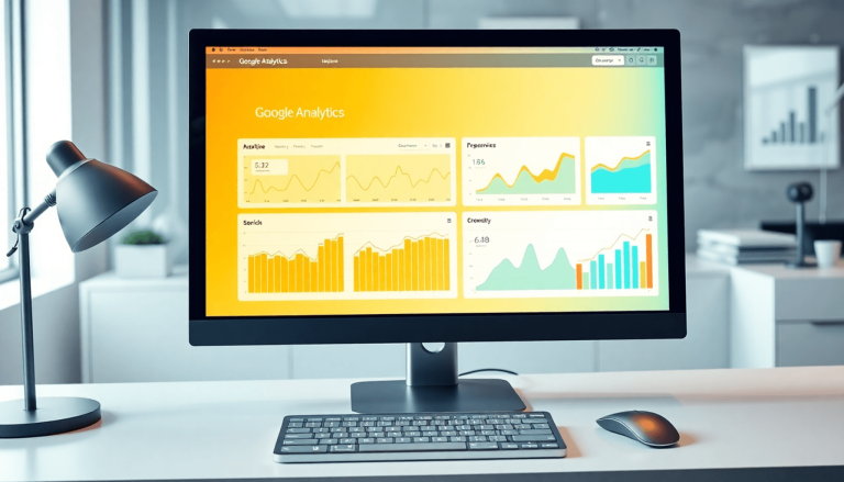
Mobile SEO Tools
In addition to the aforementioned methods, there are several other useful strategies and resources available to optimize your WordPress site for mobile users. These mobile SEO tools offer valuable insights and assistance in improving your site’s mobile performance.
Advanced Strategies for Mobile Optimization
Ensuring your WordPress site is optimized for mobile users involves several key practices:
Content Adjustments
- Responsive Typography: Make sure your fonts are legible on smaller screens by using relative units like
emorreminstead of fixed sizes. - Concise Headlines: Write shorter, impactful headlines that fit well within mobile screen limits.
- Mobile-Friendly Forms: Use simplified forms with fewer fields to enhance user experience on mobile devices.
Efficient Use of Interactive Elements
- Touch-Friendly Buttons: Design buttons large enough to be easily tapped with a finger, typically around 44×44 pixels.
- Simplified Navigation: Implement a clean, easy-to-use navigation menu that collapses into a hamburger icon for mobile users.
- Avoid Pop-Ups: Minimize or eliminate intrusive pop-ups that can frustrate mobile visitors and potentially harm your SEO.
Careful Graphics Optimization
- Vector Graphics: Use SVG images where possible, as they scale perfectly without losing quality.
- Adaptive Images: Serve different image sizes based on the device accessing the site. This can be managed through responsive images (
srcsetattribute) or plugins designed for this purpose.
Diligent Testing
Regularly testing your site’s mobile-friendliness ensures that all optimizations are effective. Here are additional tools you can use:
- GTmetrix Mobile Test: Offers detailed insights into how well your site performs on mobile devices.
- Lighthouse Audit: Google’s Lighthouse tool provides comprehensive reports on performance, accessibility, best practices, and SEO specifically for mobile.
By incorporating these advanced techniques alongside the foundational methods previously discussed, you can significantly enhance your WordPress site’s appeal and functionality for mobile users.
Conclusion
A mobile-friendly site is no longer optional but essential in today’s digital landscape. With an increasing number of users accessing the web via mobile devices, your WordPress site must cater to this audience to maximize web traffic and engagement. According to Statista, mobile devices accounted for over half of global website traffic in 2021, emphasizing the importance of optimizing your site for mobile users.
Implementing the steps discussed below will ensure that your WordPress site meets Google recommendations for a seamless user experience across all devices:
- Choosing a mobile-friendly theme
- Previewing and optimizing the mobile display
- Considering Google AMP
- Using mobile-optimized plugins
- Optimizing content and testing mobile-friendliness
Prioritize these actions to enhance user satisfaction and improve search engine rankings. The investment in making your site mobile-friendly will yield significant returns in terms of increased reach and better engagement.
FAQs (Frequently Asked Questions)
What does it mean for a website to be mobile-friendly?
A mobile-friendly website is designed and optimized to display and function effectively on various mobile devices, ensuring a seamless user experience regardless of the screen size or device type.
Why is it important to have a mobile-friendly website?
Having a mobile-friendly website is crucial in today’s digital landscape due to the increasing usage of mobile devices for browsing. It enhances user experience, improves SEO, and allows businesses to reach a wider audience.
How does mobile-friendliness impact SEO and user experience?
Mobile-friendliness positively impacts SEO by improving search rankings and user experience by providing a seamless and accessible interface for mobile users, leading to higher engagement and retention.
How can I find and install a mobile-friendly theme for WordPress?
You can find and install a mobile-friendly theme from the WordPress theme directory or third-party marketplaces by conducting a search for responsive design themes and following the installation instructions provided by the theme developer.
What are the benefits of using a responsive design theme for WordPress?
Using a responsive design theme ensures that your website adapts to different screen sizes and devices, providing an optimal viewing experience for visitors. It also simplifies maintenance by eliminating the need for separate desktop and mobile versions of the site.
How can I optimize my WordPress site for different screen sizes?
You can optimize your WordPress site for different screen sizes by using the built-in mobile preview feature to assess responsiveness, focusing on key areas such as navigation, content layout, and media display, and ensuring consistency between the mobile and desktop versions of the site.

![How to Set Up Daily Backups for Your WordPress Site Without Plugins [2025 Guide]](https://wordpressassistance.com/wp-content/uploads/2025/08/backup-wordpress-site-without-plugin-768x403.jpg)